THIS BLOG READS LIKE A BOOK. START AT THE TOP AND GO DOWN. WHEN YOU GET TO THE BOTTOM, CLICK ON "OLDER POST" FOR THE NEXT CHAPTER/POST.
(This blog is a slightly revised version of a series of forum posts at
http://www.tarotforum.net/showthread.php?t=250475.)
I finally got around to reading Wirth’s 1927 tarot masterpiece, Tarot des Imagiers des Moyen Age, in the English translation
(Tarot of the Magicians), and I was quite impressed with what I
saw. People know his deck more than what he says about it, most of which
could apply to any Marseille-based deck.
Weiser
deserves our thanks for reissuing the classic, and Mary Greer for
putting her prestige and thought behind it with an introduction. However
that edition is also something of a disappointment, for several
reasons. One is that certain definite errors that existed in the 1985
translation have not been corrected. Secondly, some new errors have been
introduced in the footnotes, caused by the different pagination of the
two editions. Another thing is that the illustrations, which were not
high quality in 1985 compared to the original or the French reprints,
are if anything more poorly reproduced in 2012 than in 1985—while
repeating at least one error that got introduced into the French version
of one major illustration). Perhaps in an attempt to rectify the
omissions, but without consulting the original 1927 edition, the 2012
anonymous editor (not Mary Greer, she assures us) added some poor-quality inappropriate
illustrations of their own. And finally, while the 1927 original and the
1985 translation had an index, the 2012 version and the later French
editions do not.
There is also one other category of
error: errors in the original edition that have been corrected in either
the later French editions or the English translation. I have found what
I think is one example of this type. This error seems to me a
counter-example to the conventional wisdom that when discrepancies exist
between editions, one should always take the first edition as
expressing the author’s intention.
The editions I will be referring to are these:
1927 original, in French. The introductory material is all by Wirth, first a lengthy dedication, entitled "A la mémoire de Stanislas de Guati"; and second, an "Avant-Propos", also called "Preface" on its later pages, at the top of the right-hand pages. There is an index. The book came with 22 cards about 5 inches high especially designed for that edition. Black and white versions of these cards, designed originally for the 1889 Tarot des Bohemiens by Papus, appear at the beginnings of the chapters devoted to individual cards.
1966 edition, in French, published by Tchou with an introduction by Roger Caillois. The phrase "A la mémoire de Stanislas de Guaita" is given a page of its own, as though it were the dedication. The actual dedication of some pages is left untitled. There is no index. This edition is reprinted often, most recently in October 1914. I could find no differences among these printings. The book comes with 22 cards about 5 inches high especially designed for the 1966 edition, i.e. not by Wirth himself. Black and white versions of these cards also appear at the beginnings of the chapters devoted to individual cards. Many of the illustrations inserted into the text in the original edition are omitted in their first appearance but included in a chapter at the end devoted to them. Some illustrations, including all the 1889 versions of the cards, are omitted entirely, and a couple of inappropriate ones added not in the original,..
1985. English translation published by Weiser. Translator's name not given, but "help" from two named individuals is acknowledged. The layout is similar to the Tchou, except that this one has two columns on the page. "To the memory of Staislas de Guaita" appears by itself as a dedication, with what originally followed as a dedicaition of some pages called "Preface". The original "Avant-Propos" is now called "Introduction". The illustrations are much the same as in the 1966 Tchou, although with more omissions. (Details will follow later in this blog.) There is an index, with the same entries as in the 1927 edition. No cards are included. Reprinted 1990.
2012. Reprint of the 1985 translation, but now with an introduction by Mary K. Greer. Many of the illustrations inserted in the text kept in 1966 and 1985 are omitted, with a few substitutions, mostly inappropriate. Eight pages on stiffer paper in the back have color reproductions of the 1889 cards, 4 inches high, appropriate to be cut out. There is no index. Reprinted 2013.
Tuesday, February 9, 2016
Textual errors, or departures from the original, before the conclusion
Most of the gross translation errors are in the Conclusion. However there are a couple early on, ones so obvious they perhaps doesn’t count as errors as opposed to a choice. First, of course, is the title, “Imagiers” is not “Magicians”. It means “image-makers”, an appropriately broad term that includes sculptors, painters of frescoes, illuminators, perhaps even writers who describe a painting, imaginary or real. To put after “imagiers” the phrase “des moyen age” means that the tarot he is concerned with is that based on medieval images. Whether there was an earlier sequence of images corresponding to the tarot before the late Middle Ages is an issue he wishes to set aside.
Then very soon comes another error that is surely another choice. It is in the translation of Wirth’s “Papesse”, a French word he was careful to put at the bottom of his card, visible even in the English translation of his book. The translation of “Papesse” is not “Priestess”, but “Popess”. “Papesse” is a term that first occurs in connection to the tarot, first documented as “Papessa” in a late 15th century Italy list of the special cards. The corresponding English term, by analogy, is “Popess.”
One error the English translation does not fall into is an egregious one in the 1966 Tchou French edition and all subsequent French editions and reprints, or at least ones with the introduction by Roger Caillois—even as late as October 2014. The Tchou/Caillois switches the divinatory meanings for the Popess and the Pope. So the Popess, card 2, gets Gevurah and strictness, while the Pope, card 5, gets Hochmah and wisdom. Such a switch is manifestly absurd, given Wirth’s Kabbalistic framework, in which card 2 corresponds to sefira 2, card 5 to sefira 5, and so on for all the cards up to 10. It also contradicts what said in the chapter on each of these cards before the part on “divinatory meanings”, which is the chapter’s end and conclusion. In making the switch, however, Tchou failed to switch the footnotes, which are grouped by chapter. There is a footnote indication (the small “1”) in the Popess meanings but no such footnote for that page in the back of the book. Instead, the footnote is listed in the group for the Pope card, for the page with the divinatory meanings.
Here are the relevant pages: first, the Papesse divinatory meanings in the original edition:
https://blogger.googleusercontent.com/img/b/R29vZ2xl/AVvXsEifvzLAbLJ9uubQOYNgC0xaaEj4LgiAn4eAZEAbRei1-hCvBhtkVg5FaQKpiNtRF0x8XuCWbade1XwkEA1UIqlXCZ2rzturTDRbEsgJGe1K1lCGiiMd1fn_iqlv5P3eh2mYnWY7yRhYO6M/s1600/wirthPapesse1927.tif
And then in the Tchou edition (I used the 2014): https://blogger.googleusercontent.com/img/b/R29vZ2xl/AVvXsEg8L3c-bhZi0ACXCjfCoMqGt7k0l84MiemSSIcHCzCp0qli0VCrksfgA43mMG4amOiNLm4YsvgqCVIGSGdQKvklDt1ZWRqGnAdwaSwSaeEp99OLiy2str72Ziea_P_i85k_F1sS0A76ryE/s1600/WirthPapessa2014.tif
You can see how it is Hochmah in the original and Geburah in the reprint.
And here is the divinatory meanings section of the reprint's "Pope" section (after which "L'Amoureux" follows. You can see how the Hochmah meanings ended up here: https://blogger.googleusercontent.com/img/b/R29vZ2xl/AVvXsEgrlZ9-07pmxD_-LDzdMlaFdQ32qVfzRbd-ZNZZ838d5hhcFnLazohGLLfKOBuHcjEFuYBtOS0lb2wg_vaoVeJ99bXARdeZ0Tk2WCC7iX3mrMYhvYEm4X-iD6MWzgHGmZ3iNRtBE6ZLI8Y/s1600/WirthPapa1.tif
It might be argued that the switch was inadvertent, owing to the fact that in both cases there is nothing on the reprint's page except the divinatory meanings, and there is no page number at the bottom of the page. Possibly, but the switch, which started in 1966, continues to this day. With no page numbers on the pages to be switched, it would be an easy error to fix.
There is one place where a discrepancy between versions is clearly deliberate rather than inadvertent, this time in the English translation rather than in the French editions. In the chapter on Temperance, in the part on divinatory meanings, the English translation reads “mysteries of water and fire”, whereas the original (repeated in the French editions) has “mystères de l’eau et du froid”, i.e. mysteries of water and cold. Did the French typesetter inadvertently introduce a word different from that in Wirth’s manuscript, or did Wirth really mean “cold”?
It might help to look at the context. The surrounding text has:
Earlier in the chapter, Wirth had given an alchemical analysis of the Temperance lady’s two jugs:
From this passage one would think that the “de l’eau et du froid” (“water and cold”) later should have been “de l’eau et du feu”, i.e. “water and fire”.
Earlier he had discussed the two jugs, the lower one of gold, the upper of silver. Gold is associated with the sun and the warmth of day, silver with the moon and the cold of night. In that case it could be “mysteries of hot and cold” or even “mysteries of fire and cold”, since fire is hot. Since the moon is associated with water as well as the cold of night, it could also be “mysteries of water and fire”. But not “mysteries of water and cold”.
I can find nothing at all in the preceding narrative that talks about “froid”, cold, specifically. There is one passage in which he says of the “angel” in relation to the flower that “it [the angel] waters it [the flower] or condenses the morning dew on it so as to allow it to resist the heat of the day”. But this is not about cold specifically; it is about the tendency of heat to dry out something.
I conclude that in this passage the English translation has correctly changed the meaning of Wirth’s printed text. I only wish that the translator had given a footnote explaining this choice.
There are a few errors in the translation of Wirth's alchemical terminology in chapter 5. On p. 46 of the 2012 English version (p. 50 of the earlier one), Wirth distinguishes among three things, "Antimony", "Verdigris" and something called "Venus of Bronze." The French has "Vénus ou Cuivre", meaning "Venus or Copper". Venus is the goddess associated with the metal copper.
Later in the chapter (p.49 of the 2012, p. 52 of the 1985) there is mention of something called "Oil or Sulphur". It should be "Oil of Sulphur". Also, the usual name for the opposite of "dry" in English is "wet" rather than "humid" or "damp", even if the French has "humide".
In general the translation is really excellent, however--except in the Conclusion, which I will take up next.
Then very soon comes another error that is surely another choice. It is in the translation of Wirth’s “Papesse”, a French word he was careful to put at the bottom of his card, visible even in the English translation of his book. The translation of “Papesse” is not “Priestess”, but “Popess”. “Papesse” is a term that first occurs in connection to the tarot, first documented as “Papessa” in a late 15th century Italy list of the special cards. The corresponding English term, by analogy, is “Popess.”
One error the English translation does not fall into is an egregious one in the 1966 Tchou French edition and all subsequent French editions and reprints, or at least ones with the introduction by Roger Caillois—even as late as October 2014. The Tchou/Caillois switches the divinatory meanings for the Popess and the Pope. So the Popess, card 2, gets Gevurah and strictness, while the Pope, card 5, gets Hochmah and wisdom. Such a switch is manifestly absurd, given Wirth’s Kabbalistic framework, in which card 2 corresponds to sefira 2, card 5 to sefira 5, and so on for all the cards up to 10. It also contradicts what said in the chapter on each of these cards before the part on “divinatory meanings”, which is the chapter’s end and conclusion. In making the switch, however, Tchou failed to switch the footnotes, which are grouped by chapter. There is a footnote indication (the small “1”) in the Popess meanings but no such footnote for that page in the back of the book. Instead, the footnote is listed in the group for the Pope card, for the page with the divinatory meanings.
Here are the relevant pages: first, the Papesse divinatory meanings in the original edition:
https://blogger.googleusercontent.com/img/b/R29vZ2xl/AVvXsEifvzLAbLJ9uubQOYNgC0xaaEj4LgiAn4eAZEAbRei1-hCvBhtkVg5FaQKpiNtRF0x8XuCWbade1XwkEA1UIqlXCZ2rzturTDRbEsgJGe1K1lCGiiMd1fn_iqlv5P3eh2mYnWY7yRhYO6M/s1600/wirthPapesse1927.tif
And then in the Tchou edition (I used the 2014): https://blogger.googleusercontent.com/img/b/R29vZ2xl/AVvXsEg8L3c-bhZi0ACXCjfCoMqGt7k0l84MiemSSIcHCzCp0qli0VCrksfgA43mMG4amOiNLm4YsvgqCVIGSGdQKvklDt1ZWRqGnAdwaSwSaeEp99OLiy2str72Ziea_P_i85k_F1sS0A76ryE/s1600/WirthPapessa2014.tif
You can see how it is Hochmah in the original and Geburah in the reprint.
And here is the divinatory meanings section of the reprint's "Pope" section (after which "L'Amoureux" follows. You can see how the Hochmah meanings ended up here: https://blogger.googleusercontent.com/img/b/R29vZ2xl/AVvXsEgrlZ9-07pmxD_-LDzdMlaFdQ32qVfzRbd-ZNZZ838d5hhcFnLazohGLLfKOBuHcjEFuYBtOS0lb2wg_vaoVeJ99bXARdeZ0Tk2WCC7iX3mrMYhvYEm4X-iD6MWzgHGmZ3iNRtBE6ZLI8Y/s1600/WirthPapa1.tif
It might be argued that the switch was inadvertent, owing to the fact that in both cases there is nothing on the reprint's page except the divinatory meanings, and there is no page number at the bottom of the page. Possibly, but the switch, which started in 1966, continues to this day. With no page numbers on the pages to be switched, it would be an easy error to fix.
There is one place where a discrepancy between versions is clearly deliberate rather than inadvertent, this time in the English translation rather than in the French editions. In the chapter on Temperance, in the part on divinatory meanings, the English translation reads “mysteries of water and fire”, whereas the original (repeated in the French editions) has “mystères de l’eau et du froid”, i.e. mysteries of water and cold. Did the French typesetter inadvertently introduce a word different from that in Wirth’s manuscript, or did Wirth really mean “cold”?
It might help to look at the context. The surrounding text has:
Transmutations d'ordre vital. Alchimie psychique. Régénération. Mystères de l'eau et du froid. Miracles. Fontaine de Jouvence.The English translation, however, says:
Transmutation of a vital order. Psychic Alchemy. Regeneration. Mysteries of water and fire. Miracles. The fountain of youth.There is no way that froid, which means "cold", can be translated as "fire". So which is right?
Earlier in the chapter, Wirth had given an alchemical analysis of the Temperance lady’s two jugs:
En Alchimie le sujet, noirci à souhait, donc mort et purifié, est soumis à l'ablution. Cette opération utilise les pluies successives provenant de la condensation des vapeurs, qui se dégagent du cadavre sous l'action d'un feu extérieur modéré, alternativement activé puis ralenti. De ces pluies réiterés résulte le lavage progressif de la matière, qui, du noir passe au gris et finalement au blanc.And the published English translation:
In Alchemy the subject, blackened as much as he wishes, hence dead and purified, then undergoes ablution. This operation uses the constant waters formed through condensation of vapours which emanate from the corpse by means of moderate fire outside, which is, in turn, allowed to flare up and die down. From this repeated action of making water results the cleansing of the subject who turns from black to grey, then finally to white.There are some minor errors here, but nothing that the reader could not figure out by himself or herself: “blackened as much as he wishes” should be “blackened as much as wished”; “constant” should be “continual”; and the “who” in the last sentence should be “which”.
From this passage one would think that the “de l’eau et du froid” (“water and cold”) later should have been “de l’eau et du feu”, i.e. “water and fire”.
Earlier he had discussed the two jugs, the lower one of gold, the upper of silver. Gold is associated with the sun and the warmth of day, silver with the moon and the cold of night. In that case it could be “mysteries of hot and cold” or even “mysteries of fire and cold”, since fire is hot. Since the moon is associated with water as well as the cold of night, it could also be “mysteries of water and fire”. But not “mysteries of water and cold”.
I can find nothing at all in the preceding narrative that talks about “froid”, cold, specifically. There is one passage in which he says of the “angel” in relation to the flower that “it [the angel] waters it [the flower] or condenses the morning dew on it so as to allow it to resist the heat of the day”. But this is not about cold specifically; it is about the tendency of heat to dry out something.
I conclude that in this passage the English translation has correctly changed the meaning of Wirth’s printed text. I only wish that the translator had given a footnote explaining this choice.
There are a few errors in the translation of Wirth's alchemical terminology in chapter 5. On p. 46 of the 2012 English version (p. 50 of the earlier one), Wirth distinguishes among three things, "Antimony", "Verdigris" and something called "Venus of Bronze." The French has "Vénus ou Cuivre", meaning "Venus or Copper". Venus is the goddess associated with the metal copper.
Later in the chapter (p.49 of the 2012, p. 52 of the 1985) there is mention of something called "Oil or Sulphur". It should be "Oil of Sulphur". Also, the usual name for the opposite of "dry" in English is "wet" rather than "humid" or "damp", even if the French has "humide".
In general the translation is really excellent, however--except in the Conclusion, which I will take up next.
textual errors in the Conclusion
The Conclusion is long quotes from Lévi followed by some reflections by
Wirth. Two of the long quotes are short characterizations of the 22
arcana. In the first set, item 2 is of interest (p. 201 of the 2012, 196
of the earlier). Item 1 had the sentence, "All announces an active
intelligent cause" ("Tout annonce une cause active, intelligente.").
Then for item 2, the published English version reads:
Item 17 speaks of "Vesper and her dew"--"Vesper et sa rosée". Actually, Vesper as a god is male. English requires a gender here, whereas the French doesn't. Since he has a maiden on the card, perhaps Wirth was thinking female. He would have done better to choose Venus.
The next set has several items of interest. Its number 4 (p. 203, 198 of the earlier) speaks of "the tetragram, the quarter, the cubic stone or its base". The French has "quaternaire", for which the proper English translation would be "quaternary".
Number 6 goes, in the published English version (p. 204):
Then for 8:
Next is a quote from Lévi about arranging the arcana in either a square or a triangle, and "placing the even numbers in opposition and reconciling them with the uneven numbers". "Uneven" would be more simply put as "odd". Then comes:
Then (p. 205/199) Wirth speaks in his own voice, attacking unnamed so-called "occultists" for their simple-mindedness. There is a sentence that as it reads attributes simple-mindedness to the Popess (known in this translation as the Priestess.
Wirth concludes this paragraph in another sentence whose meaning is unclear in the translation:
The Appendix of the 2012 has the title "Some Indications on the Symbolism of the Pantacles which accompany the present work". The earlier English version, like the 1966 French, had "Pentacles". The 2012 has restored the original spelling back to "Pantacles". This gesture of faithfulness to Wirth was unnecessary, as the word "pantacles" has no clear meaning in English and is not listed in any regular dictionary. The word "pentacle", however, has established itself in English as a generic word for a talisman., not only as a five-sided figure but also as a generic word for a magical talisman of a "similar" form, with the question of how similar left open. The English Oxford Dictionary, internet edition, says, for "pentacle":
2. The number serves as proof of the living unit.The French is
2. Le nombre sert de preuve à la unité.My translation (also that of the English translation of Levi) would be
2. Number serves as proof of unity.The saying is mysterious in either case, and "Le nombre" is ambiguous between "the number"--i.e. 2, I suppose--and number as an abstraction, like unity. I think the idea is that without multiplicity there would be no concept of unity, and vice versa, but I may be wrong. There must be a translation of Lévi's original somewhere, but I can't find it.
Item 17 speaks of "Vesper and her dew"--"Vesper et sa rosée". Actually, Vesper as a god is male. English requires a gender here, whereas the French doesn't. Since he has a maiden on the card, perhaps Wirth was thinking female. He would have done better to choose Venus.
The next set has several items of interest. Its number 4 (p. 203, 198 of the earlier) speaks of "the tetragram, the quarter, the cubic stone or its base". The French has "quaternaire", for which the proper English translation would be "quaternary".
Number 6 goes, in the published English version (p. 204):
6. Linking, crochet, phallus, tangle, union, embrace, struggle, antagonism, combination, balance."Crochet" in English is knitting. Probably Wirth meant "hook". Otherwise, the translation has "phallus" where the French has "lingam". Probably Lévi meant an allusion to Hinduism rather than to Greece.
Then for 8:
Balance scales, attraction and repulsion, life fear, promise and threat.The French has
Balance, attraît et répulsion, vie, frayeur, promesse et menace.The French "balance" means "scales"; in general, for the English "balance" the French would say "equilibre" (as Wirth does in item 6, at the end). However it may be that the sense of the English "balance" is not excluded. So:
Scales [Fr. balance], attraction and repulsion, life, terror, promise and threat.Several of the items (nos. 13, 14, 16, 16, 17, 19) speak of a "sky" of this or that planet, and, with less orthodoxy, of the soul. In Ptolemaic astronomy the planets each have a "heaven", for ten in all. The French is "ciel", which could be translated either as "sky" or "heaven" but here means "heaven". Wirth is quoting Lévi's idea that the later arcana correspond to particular heavens, in a descent from the macrocosm to the microcosm.
Next is a quote from Lévi about arranging the arcana in either a square or a triangle, and "placing the even numbers in opposition and reconciling them with the uneven numbers". "Uneven" would be more simply put as "odd". Then comes:
Thus the solution of all questions of magic is that of the pentagram, and all antimonies are explained by a harmonious unity.Here the word "antimonies" should of course be replaced with "antinomies", exactly the same in French and English.
Then (p. 205/199) Wirth speaks in his own voice, attacking unnamed so-called "occultists" for their simple-mindedness. There is a sentence that as it reads attributes simple-mindedness to the Popess (known in this translation as the Priestess.
Did this occultist bow before the Priestess for whom nothing occult exists any more?he French is
Se sont-ils inclinés devant la Papesse, ces occultists pour qui n'existe plus rien d'occulte?which means:
Did they bow before the Popess, these occultists for whom nothing occult [or hidden] exists any more?It is not the Popess for whom nothing hidden exists, but the occultists whom Wirth is attacking.
Wirth concludes this paragraph in another sentence whose meaning is unclear in the translation:
Lured by their faith in doctrines which have the gift of winning them, they swear in the name of Masters whose profound thought they have not understood and they erect in Perez their occultist church.Who or where is this "Perez". Actually the word is "Pères", Fathers, as we can see:
Fasciné par leur foi en des doctrines qui ont eu le don de les séduire, ils jurent au nom de Maîtres dont ils n'ont pas saisi le pensée profonde et qu'ils érigent en Pères de leur église occultiste.The sentence should read:
Lured by their faith in doctrines which have the gift of seducing them, they swear in the name of Masters whose profound thought they have not understood and whom they erect as Fathers of their occultist church.Then (206/199) a feminine personification under goes a change of gender in translation. The English version has:
In the interest of human progress the time has come to unite Imagination and Reason. The female and the male must support each other in order to give the great redeeming light to the world.A worthy sentiment. However in the French the second sentence reads:
Les deux soeurs doivent se soutenir pour octoyer au monde la grande lumière rédemptrice.That is,
The two sisters must support each other...On the next page (207/200) Wirth talks, in the English, about how without imagination, we are "reducing our spirit's field of action", such that "there is some obscurantism in the philosophy of the rationalists". The word "esprit" can mean either "mind" and "spirit". Since later he talks about "notre avenir mental"--our mental future--it is clear that "mind" is the proper translation. He compares those who do not "dare to imagine" to those who stay on land due to ignorance of the laws of ocean navigation
Shall we stay on land when our mental future is on the water?
(Resterons-nous à terre alors que notre avenir mental est sur l'eau?Finally, there is his last sentence, before his interesting Appendix. The English version has:
Turn inwards, following the precept of the Wise man who urges ou to search for the Stone hidden in the depths of self?But Wirth is not speaking the language of Carl Jung or religious mysticism. What he says is:
Pénètre en toi-même, fidèle au précepts du Sage qui t'angage à chercher la Pierre cachée en ton intérieure le plus profond.That is:
Penetrate inside yourself, faithful to the precepts of the Sage who urges you to search for the Stone hidden in your deepest interior.The language is meant to echo alchemy. The Emerald Tablet says, "For it is able to penetrate and subdue everything subtle and everything crude and hard." And one of the alchemical emblems for which Wirth shows us the Latin says, "Visit the interior of the earth, and rectifying, you will find the hidden stone".
The Appendix of the 2012 has the title "Some Indications on the Symbolism of the Pantacles which accompany the present work". The earlier English version, like the 1966 French, had "Pentacles". The 2012 has restored the original spelling back to "Pantacles". This gesture of faithfulness to Wirth was unnecessary, as the word "pantacles" has no clear meaning in English and is not listed in any regular dictionary. The word "pentacle", however, has established itself in English as a generic word for a talisman., not only as a five-sided figure but also as a generic word for a magical talisman of a "similar" form, with the question of how similar left open. The English Oxford Dictionary, internet edition, says, for "pentacle":
As is clear from Wirth's examples, by "pantacle" he means a magical symbol, in two dimensions, of either an abstract design, a picture of something that would normally exist in three dimensions, a series of inscribed words, or a combination of these.A pentagram, esp. one enclosed in a circle; a talisman or magical symbol in the shape of or inscribed with a pentagram. Also, in extended use: any similar magical symbol (freq. applied to a hexagram formed by two intersecting or interlaced equilateral triangles).
textual errors in the footnotes
Some of these errors are
translation errors in both the 1985 and the 2012 editions. Others are
new errors introduced into the 2012 edition from incorrect changes in
the page numbers between editions. The numbers had to be changed, but
whoever did it was not consistently good at the job.
First, the title of the section is translated incorrectly, in both the 1985 and 2012. The French title is “Notes”, and indeed that is what they are, and not a hard word to translate. In the English versions, the title is “References”. Some of the footnotes are references, but most are not.
In the French reprint, the footnotes are also in the back of the book, as opposed to the bottom of the page where they were in the original. But the French reprint, unlike the English, gives the page number for that footnote in the text. That has been omitted from both English versions, making it difficult to refer back to the text unless one has read the footnote while in the course of reading that very page of the text. Instead, the English versions simply number the footnotes consecutively.
In footnote 2, reference is made to a writer named, in the original, "Goethe". The name appears as “Gothe” in the English versions.
Footnote 21 says that the crayfish on card 18 is red “to indicate its effrey colour”. I cannot find "effrey" in a dictionary, even the OED. The last two words in the French are “caractère igné”, meaning “fiery character”, which fits what Wirth says about the crayfish in the text:
Footnote 27 speaks of the "‘light’ through which the occultist swears". The preposition in French is “par”, meaning “by”.
Footnote 28, in both English versions, leaves out Wirth’s suggestion that we go to a certain other page of the text. In the 2012 edition, that would be page 45. In the 1985, it would be p. 49.
Footnote 31 refers us to pp. 76-78. That should be, in the 2012, pp. 45-46.
Footnote 53 speaks of the “Prince of the World” and refers us to p. 75. The French is “ce Monde”, so “this World”. The reference in the 2012 edition should be to p. 70.
Footnote 58 misspells “femininity” as “feminity”.
Footnote 64 speaks of “a park of sterile tree with lush foliage”, an image from Goethe, spelled correctly. But the French has “arbres”, i.e. “trees”, which is surely right.
First, the title of the section is translated incorrectly, in both the 1985 and 2012. The French title is “Notes”, and indeed that is what they are, and not a hard word to translate. In the English versions, the title is “References”. Some of the footnotes are references, but most are not.
In the French reprint, the footnotes are also in the back of the book, as opposed to the bottom of the page where they were in the original. But the French reprint, unlike the English, gives the page number for that footnote in the text. That has been omitted from both English versions, making it difficult to refer back to the text unless one has read the footnote while in the course of reading that very page of the text. Instead, the English versions simply number the footnotes consecutively.
In footnote 2, reference is made to a writer named, in the original, "Goethe". The name appears as “Gothe” in the English versions.
Footnote 21 says that the crayfish on card 18 is red “to indicate its effrey colour”. I cannot find "effrey" in a dictionary, even the OED. The last two words in the French are “caractère igné”, meaning “fiery character”, which fits what Wirth says about the crayfish in the text:
The crayfish of the Tarot is red, not because it is cooked, but rather, because of the inner fire that makes it deploy in ceaseless activity to fulfill its mission of salubrity..Footnote 22 in the 2012 refers us to pages 24 and 25 for more information on the “Baldini cards”. The correct reference is page 8.
Footnote 27 speaks of the "‘light’ through which the occultist swears". The preposition in French is “par”, meaning “by”.
Footnote 28, in both English versions, leaves out Wirth’s suggestion that we go to a certain other page of the text. In the 2012 edition, that would be page 45. In the 1985, it would be p. 49.
Footnote 31 refers us to pp. 76-78. That should be, in the 2012, pp. 45-46.
Footnote 53 speaks of the “Prince of the World” and refers us to p. 75. The French is “ce Monde”, so “this World”. The reference in the 2012 edition should be to p. 70.
Footnote 58 misspells “femininity” as “feminity”.
Footnote 64 speaks of “a park of sterile tree with lush foliage”, an image from Goethe, spelled correctly. But the French has “arbres”, i.e. “trees”, which is surely right.
discrepancies in illustrations in Part I
Wirth was an illustrator before he was a writer. His visual imagination
shows, with many illustrations sprinkled throughout the book
illustrating the points he is making. In my view it does not do justice
to the author when a later edition removes these illustrations from
their original place just because they also appear somewhere else (in
the Appendix), or even worse, exchanges the illustration he uses for
another that doesn't fit. This particular sin (committed only once in
the material I am covering in this post) was not committed in 1985 or in
the French editions, but is in the 2012.
So now I will go through the book page by page, focusing on discrepancies between the illustrations in the original and those of the later editions. Much of this part of the 2012 is is in Google Books (which also has Greer's introduction), starting with the “Author’s Preface”, at https://books.google.com/books?id=N_...skills&f=false. So if you want, feel free to follow along.
A charming feature of Wirth’s 1927 text is that the first letter of each chapter is enclosed within a tarot-like scene, in the style of medieval illuminated manuscripts. These could not have been reproduced in the translation, considering that the initial letters of the English will be different. Unfortunately, the post-1927 French editions omit these illustrations as well. As an example I reproduce the first one, at the beginning of Chapter One.

Above the dedication “a la memoire de Stanislas de Guaita” is an illustration that Wirth repeats at the very end of the book. It has 22 images, so it is obviously meant to illustrate the 22 cards of the tarot. They are another version of the cards, one of many that he uses throughout the book, of which at least one other, the "astronomical tarot," is his design. In reading the book, I think the implication is, one will come to understand what these symbols mean in relation to the 22 arcana (or “arcanas,” as the English translation has it).
In the post-1927 editions, both French and English, this illustration only appears at the end of the book (p. 222 of the 2012, p. 214 of the 1985, p. 363 of the 2014 French). So you don’t get the pleasure of relating these images to the 22 arcana as you go through the book. The 2012 actually outdoes the others by its poor quality reproduction (p. 222):

That is even more mysterious than Wirth’s original. However it is not the sort of mystery we really need. In the Appendix Wirth calls these images a "symbolic alphabet" of "ideograms". They can even be used instead of the colored printed cards, by copying the symbols onto numbered pieces of paper, an activity he recommends so as to personalize the use of the cards. Of course with the 2012's version, that would not be possible, given how much is missing.
At the end of the dedication (the "Author's Preface") is this illustration:

It is not present in any of the later editions (except in the Appendix). Part of the intent in placing it here might be to announce the Kabbalistic orientation of what is to come. Also, as I read in the Appendix (p. 217 of 2012, pp. 208-9 of 1985, pp. 352-3 of 2014 French), de Guaita invented this emblem.
I continue. The 2012 on p. xxv (the end of the “Author’s Introduction”. omitted from Google Books) has a black and white reproduction of a scene of people playing cards in a tent. The cards are not tarot cards, but ones with ordinary French suits, of the sort that were invented around 1470. It is not in in Wirth’s original, nor that of the later French editions. Nothing is said about this illustration. It obviously would look better in color.

It seems to be a substitute for an illustration in the French editions, equally non-Wirthian, another of people playing cards. That woodcut is identified next to it as “La Consultation, bois gravé, fin du XVe siècle” (The Consultation, woodcut, end of 16th century). There are pictures of it on the Web; here is one,
 .
.
It is the so-called “card players” of Israhel van Meckenem, c. 1500. I would guess that they are playing a card game, because there is a stack of cards next to each of them. But I suppose it could be the unused part of a deck during a reading, going one card at a time rather than in a "spread" (which Etteilla says he invented), and the scene done in a deliberately ambiguous way in case the Inquisition came knocking.
These illustrations are at the end of the “Avant-propos” (or "Author’s Introduction”). Wirth’s original also ends with an illustration, also on the subject of ordinary playing cards: it is of the four objects on the Bateleur’s (Magician’s) table, symbolic of the four suits.

There is nothing in the “Avant-Propos” about such cards, but there is in Chapter One that follows. They were invented by the Italians, he says, toward the end of the 14th century (at that time the similar “Mamluk” cards of Egypt apparently were not known). They divided into Bâtons, Coupes, Epées, and Deniers. In French “bâton” means “staff” or “stick”. The English translation has “wand”; but Wirth does not use the term corresponding to the English “wand”, i.e. “baguette”, although he does add that the “baguette magique” is one type of Baton. Likewise “denier” just means “coin”, not “pentacle,” as the English translation has it; but he does say that this “denier” is a “disque pentaculaire,” using the adjectival form of “pentacle”. According to the OED “pentacle” comes from the Middle French, meaning “talisman, most often in the form of a five-pointed star,” first attested in 1555; it is most typically in the shape of a pentagram enclosed by a circle. That is indeed what Wirth depicts. Such images were not, to be sure, on the cards from the beginning. The other suits are Cups and Swords. These are indeed what, in similar Italian, the suits were called before the tarot sequence was added. This emblem is also discussed on p. 364 of the 2014 French, underneath the emblem. The discussion, but without the emblem, is on p. 222 of the 2012 and p. 214 of the 1985. the two paragraphs about the "56 playing cards."
Chapter One, too, ends with an illustration; there is no image in the corresponding place in the later editions, in either language, nor any presentation of it in the Appendix of any later edition:
Again, there is no connection that I see to the chapter just ended. But this perfectly symmetrical face, looking at us in the eye as though about to speak, seems a kind of foretaste of the subject of the next chapter, which has to do with the “signs revealed by the secrets of the tarot”, in particular its symmetries taken as a whole. He arranges the tarot sequence in a circle and then into two rows that also form a circular pattern:

This particular image is included in the post-1927 versions; it serves to present patterns in the cards. But also indicates what the previous two lines of symbols, at the very beginning, correspond to in the tarot. That reference, of course, is lost on the reader if the previous sequence of symbols is not there.
At the end of this second chapter is another image, absent from the later editions, except in the Appendix. This one is from alchemy; I recognize it as the “Winged Hermaphrodite on the Winged Globe of Chaos” of the Victorium Spagyricum of 1625 .

This image again seems to relate to what follows, which ties the Kabbalist “tree of the sefirot” not only to the tarot sequence but also to the planets and metals. The alchemical emblem has symbols of the planets and an arrangement into three vertical columns, with ten items in all. It is a kind of alchemical variant on the Kabbalist “tree”. This alchemical emblem is discussed further in the Appendix, on p. 213 of the 2012, p.205 of the 1985, and p. 345 of the 2014 French. In the translation of the Appendix discussion, the metal "Bronze" is attributed to both Jupiter and Venus. The French has "Etain" (Tin) for Jupiter and "Cuivre" (Copper) for Venus.
This chapter, too, ends with an image not present in the later editions. This time it is of a mermaid moon-goddess (Wirth in the Appendix calls her a “sirene”) praying between two unicorns. It is the theme of “the lady and the unicorn” that we know from Renaissance tapestries, with a twist. The gesture of prayer upwards is something different. Among other things, it seems to announce the astronomical theme of the next chapter.
 .
.
The discussion in the Appendix is on p. 121 of the 2012, p. 213 of the 1985, and p. 362 of the 2014 French.
The next chapter, on “The Astronomical Tarot,” gives the 2012 publisher a chance to throw in some extra illustrations not in Wirth; if you see one that actually has stars in it, it is not Wirth’s. It, too, ends with an illustration. This one in fact sums up the chapter and therefore is reproduced in the later editions. However errors have crept in, starting in the French editions, made worse in the English. The errors I am going to discuss have already been pointed out on the Web at http://www.rennashesso.com/rennashes...tro-Tarot.html. However the author did not know how far back they went. To clear Wirth of any blame, here is his original; it shows two groups of constellations, the zodiac on the outside and some other constellations closer to the Pole Star on the inside.

And now here is the corresponding English version (the same in 1985 and 2012):

As you can see, the number 12 has been given to three constellations: Perseus, Gemini, and Cancer (if you have trouble finding them, the website just linked to has arrows pointing to them). Fortunately, on the facing page there is a chart with the correct numbering: 12 to Perseus, 19 to Gemini, 18 to Cancer. The assignments of 18 and 19 are familiar ones. 12 is unique to Wirth’s special “astronomical tarot". Besides this star-map, he gives us black and white sketches of some of the individual cards at appropriate places in the book (at least one of which, for the 9th card, the post-1927 editions neglect to reproduce).
This numbering errors originated in the French editions, starting in 1966 (I checked in a copy I got from Interlibrary Loan); it has been continually reprinted since. The English version only added a few spelling errors. In image 9, “Headsman” should be “Herdsman”. And the English for “Cassiopée” is not “Cassiopea” but “Cassiopeia”. The constellation named "Herdsman" is that usually called Boötes, Greek for herdsman or plowman, literally "ox-driver" (https://en.wikipedia.org/wiki/Bo%C3%B6tes). In his "astronomical" version of the card, shown at the end of the section discussing card 9 (the Hermit), he actually uses the title "Boötes." This illustration, the only one of that card, has been omitted from all the later editions, but I will give it when I get to that page of the book.
If you are wondering what a “Coachman”, Cocher, is doing with a goat on his back, that is because the constellation of Auriga, besides “Goatherd,” was also known as the Charioteer, identified with several famous ones, all sons of various Greek gods (https://en.wikipedia.org/wiki/Auriga...nstellation%29). One might have expected that this Charioteer would be given the number 7, but such is not the case.
Chapter 5, “Notions of Symbolism: Forms and Colours”, by its visual nature, is almost made to order for errors in later editions. They do mount up.
Wirth’s primary forms are the circle, the cross, the triangle and the square. After exhibiting them, he has a charming illustration of a lady on a cloud drawing them, omitted from the 2012 but not the 1985.
Then the 2012 makes another unique blunder, this time not just of omission, in substituting a drawing that appears only in the Appendix (p. 211 of the 2012, p. 203 of the 1985, p. 341 of the 2014 French) for the one that is actually in this place in the text. Here is the original (which is also in the French editions and the 1985), followed by the 2012’s substitution.


In the Appendix, Wirth says of the one with legs that it is a dragon or a crocodile. However in Chapter 5 he is talking about a drawing of a serpent in an ancient text. Moreover, it is one that has some Greek words inside, something like En To Pan, which I suppose means“One the All”, as Wirth says, or "One is All", as the translation says). Substituting a drawing without these words and of a different animal is not helpful.
Two pages later in the same chapter, the 2012 book (unlike the 1985 or the French editions) commits another error of omission. In all but the 2012, there is a list of planets plus a symbol that With invented as a way of symbolizing all of them together. The symbol is important, among other things, to convey how the planets act as a group, especially in a negative way as the “seven deadly sins”, something he talks about in the section on the Devil card (p 115 of 2012, p. 123 of 1985, p. 202 of 2014 French), and in the Appendix (p. 212 of 2012, p. 204 of the 1985, and p. 343 of the 2014 French); in both places he shows us the symbol--except in 2012. The 2012 (uniquely) omits this symbol everywhere it occurs--as though it were too devilish to see the light of day! Below is the original, followed by the 2012 translation.


Then on the next page. in the original and in all but the 2012, Wirth constructed a chart by which Jupiter’s
traits can be contrasted with Saturn’s; the visual line-up makes it
easy. Here is the original:

The 2012, again uniquely, dispenses with this left-right chart and instead presents only the Jupiter side, after which comes the discussion of Mercury.

Only on the next page does the 2012 presents the Saturn part of the chart (you can see that page here), totally detached from what it had been contrasted with.. The visual contrast has been lost.
Another omission, again uniquely in the 2012, is of a symbol of Wirth's invention that combines Sulphur and Mercury, shown below:

In the 2012, the text in English is on p. 49, second paragraph, corresponding to p. 52 of the 1980 and p. 99 of the 2014 French. The symbol has disappeared. There is also one translation or spelling error; "Huile ou Baume de Soufre, Humide radical" is not "Oil or Sulfur, Humidity" but "Oil or Balm of Sulphur, radical Humid". The French is "Humide", probably meaning "wetness"..
This mysterious image is fully explained on p.215 of the 2012; the only problem is that it has again been omitted. Only if you have the 1985 edition, p. 206, can you tell what it is that is being explained. (or p. 348 of the 2014 French, although it should have gone one paragraph higher).
You will have noticed that this alchemical discussion is extremely condensed and precise. Any slip in the translation (such as the “Venus of bronze” nonsense (which can be seen on the left of the 2012 pages earlier in this post) will lead to confusion. In this section of the text it is particularly important to have at hand the French text, of which the current reprints of the 1966 are sufficient.
The next chapter is "The Tarot and the Hebrew Alphabet," which discusses visual parallels between the arcana and the corresponding Hebrew letters, starting with the Bateleur (Magician) as Aleph). At the end, the original has a winged disc with serpents on either side of the disc (Wirth later calls it a "winged globe"). I cannot see how it relates to the Hebrew letters, but it might relate to what comes next, his presentation of the 22 arcana, as he sees the image as a symbol of alchemical sublimation, part of the "great work." Wirth discusses the emblem in the Appendix, and all editions show the image (p. 116 of the 2012, p. 207 of the 1980, and p. 330 of the 2014 French).
So now I will go through the book page by page, focusing on discrepancies between the illustrations in the original and those of the later editions. Much of this part of the 2012 is is in Google Books (which also has Greer's introduction), starting with the “Author’s Preface”, at https://books.google.com/books?id=N_...skills&f=false. So if you want, feel free to follow along.
A charming feature of Wirth’s 1927 text is that the first letter of each chapter is enclosed within a tarot-like scene, in the style of medieval illuminated manuscripts. These could not have been reproduced in the translation, considering that the initial letters of the English will be different. Unfortunately, the post-1927 French editions omit these illustrations as well. As an example I reproduce the first one, at the beginning of Chapter One.
Above the dedication “a la memoire de Stanislas de Guaita” is an illustration that Wirth repeats at the very end of the book. It has 22 images, so it is obviously meant to illustrate the 22 cards of the tarot. They are another version of the cards, one of many that he uses throughout the book, of which at least one other, the "astronomical tarot," is his design. In reading the book, I think the implication is, one will come to understand what these symbols mean in relation to the 22 arcana (or “arcanas,” as the English translation has it).
In the post-1927 editions, both French and English, this illustration only appears at the end of the book (p. 222 of the 2012, p. 214 of the 1985, p. 363 of the 2014 French). So you don’t get the pleasure of relating these images to the 22 arcana as you go through the book. The 2012 actually outdoes the others by its poor quality reproduction (p. 222):
That is even more mysterious than Wirth’s original. However it is not the sort of mystery we really need. In the Appendix Wirth calls these images a "symbolic alphabet" of "ideograms". They can even be used instead of the colored printed cards, by copying the symbols onto numbered pieces of paper, an activity he recommends so as to personalize the use of the cards. Of course with the 2012's version, that would not be possible, given how much is missing.
At the end of the dedication (the "Author's Preface") is this illustration:
It is not present in any of the later editions (except in the Appendix). Part of the intent in placing it here might be to announce the Kabbalistic orientation of what is to come. Also, as I read in the Appendix (p. 217 of 2012, pp. 208-9 of 1985, pp. 352-3 of 2014 French), de Guaita invented this emblem.
I continue. The 2012 on p. xxv (the end of the “Author’s Introduction”. omitted from Google Books) has a black and white reproduction of a scene of people playing cards in a tent. The cards are not tarot cards, but ones with ordinary French suits, of the sort that were invented around 1470. It is not in in Wirth’s original, nor that of the later French editions. Nothing is said about this illustration. It obviously would look better in color.
It seems to be a substitute for an illustration in the French editions, equally non-Wirthian, another of people playing cards. That woodcut is identified next to it as “La Consultation, bois gravé, fin du XVe siècle” (The Consultation, woodcut, end of 16th century). There are pictures of it on the Web; here is one,
. It is the so-called “card players” of Israhel van Meckenem, c. 1500. I would guess that they are playing a card game, because there is a stack of cards next to each of them. But I suppose it could be the unused part of a deck during a reading, going one card at a time rather than in a "spread" (which Etteilla says he invented), and the scene done in a deliberately ambiguous way in case the Inquisition came knocking.
These illustrations are at the end of the “Avant-propos” (or "Author’s Introduction”). Wirth’s original also ends with an illustration, also on the subject of ordinary playing cards: it is of the four objects on the Bateleur’s (Magician’s) table, symbolic of the four suits.
There is nothing in the “Avant-Propos” about such cards, but there is in Chapter One that follows. They were invented by the Italians, he says, toward the end of the 14th century (at that time the similar “Mamluk” cards of Egypt apparently were not known). They divided into Bâtons, Coupes, Epées, and Deniers. In French “bâton” means “staff” or “stick”. The English translation has “wand”; but Wirth does not use the term corresponding to the English “wand”, i.e. “baguette”, although he does add that the “baguette magique” is one type of Baton. Likewise “denier” just means “coin”, not “pentacle,” as the English translation has it; but he does say that this “denier” is a “disque pentaculaire,” using the adjectival form of “pentacle”. According to the OED “pentacle” comes from the Middle French, meaning “talisman, most often in the form of a five-pointed star,” first attested in 1555; it is most typically in the shape of a pentagram enclosed by a circle. That is indeed what Wirth depicts. Such images were not, to be sure, on the cards from the beginning. The other suits are Cups and Swords. These are indeed what, in similar Italian, the suits were called before the tarot sequence was added. This emblem is also discussed on p. 364 of the 2014 French, underneath the emblem. The discussion, but without the emblem, is on p. 222 of the 2012 and p. 214 of the 1985. the two paragraphs about the "56 playing cards."
Chapter One, too, ends with an illustration; there is no image in the corresponding place in the later editions, in either language, nor any presentation of it in the Appendix of any later edition:
Again, there is no connection that I see to the chapter just ended. But this perfectly symmetrical face, looking at us in the eye as though about to speak, seems a kind of foretaste of the subject of the next chapter, which has to do with the “signs revealed by the secrets of the tarot”, in particular its symmetries taken as a whole. He arranges the tarot sequence in a circle and then into two rows that also form a circular pattern:
This particular image is included in the post-1927 versions; it serves to present patterns in the cards. But also indicates what the previous two lines of symbols, at the very beginning, correspond to in the tarot. That reference, of course, is lost on the reader if the previous sequence of symbols is not there.
At the end of this second chapter is another image, absent from the later editions, except in the Appendix. This one is from alchemy; I recognize it as the “Winged Hermaphrodite on the Winged Globe of Chaos” of the Victorium Spagyricum of 1625 .
This image again seems to relate to what follows, which ties the Kabbalist “tree of the sefirot” not only to the tarot sequence but also to the planets and metals. The alchemical emblem has symbols of the planets and an arrangement into three vertical columns, with ten items in all. It is a kind of alchemical variant on the Kabbalist “tree”. This alchemical emblem is discussed further in the Appendix, on p. 213 of the 2012, p.205 of the 1985, and p. 345 of the 2014 French. In the translation of the Appendix discussion, the metal "Bronze" is attributed to both Jupiter and Venus. The French has "Etain" (Tin) for Jupiter and "Cuivre" (Copper) for Venus.
This chapter, too, ends with an image not present in the later editions. This time it is of a mermaid moon-goddess (Wirth in the Appendix calls her a “sirene”) praying between two unicorns. It is the theme of “the lady and the unicorn” that we know from Renaissance tapestries, with a twist. The gesture of prayer upwards is something different. Among other things, it seems to announce the astronomical theme of the next chapter.
.The discussion in the Appendix is on p. 121 of the 2012, p. 213 of the 1985, and p. 362 of the 2014 French.
The next chapter, on “The Astronomical Tarot,” gives the 2012 publisher a chance to throw in some extra illustrations not in Wirth; if you see one that actually has stars in it, it is not Wirth’s. It, too, ends with an illustration. This one in fact sums up the chapter and therefore is reproduced in the later editions. However errors have crept in, starting in the French editions, made worse in the English. The errors I am going to discuss have already been pointed out on the Web at http://www.rennashesso.com/rennashes...tro-Tarot.html. However the author did not know how far back they went. To clear Wirth of any blame, here is his original; it shows two groups of constellations, the zodiac on the outside and some other constellations closer to the Pole Star on the inside.
And now here is the corresponding English version (the same in 1985 and 2012):
As you can see, the number 12 has been given to three constellations: Perseus, Gemini, and Cancer (if you have trouble finding them, the website just linked to has arrows pointing to them). Fortunately, on the facing page there is a chart with the correct numbering: 12 to Perseus, 19 to Gemini, 18 to Cancer. The assignments of 18 and 19 are familiar ones. 12 is unique to Wirth’s special “astronomical tarot". Besides this star-map, he gives us black and white sketches of some of the individual cards at appropriate places in the book (at least one of which, for the 9th card, the post-1927 editions neglect to reproduce).
This numbering errors originated in the French editions, starting in 1966 (I checked in a copy I got from Interlibrary Loan); it has been continually reprinted since. The English version only added a few spelling errors. In image 9, “Headsman” should be “Herdsman”. And the English for “Cassiopée” is not “Cassiopea” but “Cassiopeia”. The constellation named "Herdsman" is that usually called Boötes, Greek for herdsman or plowman, literally "ox-driver" (https://en.wikipedia.org/wiki/Bo%C3%B6tes). In his "astronomical" version of the card, shown at the end of the section discussing card 9 (the Hermit), he actually uses the title "Boötes." This illustration, the only one of that card, has been omitted from all the later editions, but I will give it when I get to that page of the book.
If you are wondering what a “Coachman”, Cocher, is doing with a goat on his back, that is because the constellation of Auriga, besides “Goatherd,” was also known as the Charioteer, identified with several famous ones, all sons of various Greek gods (https://en.wikipedia.org/wiki/Auriga...nstellation%29). One might have expected that this Charioteer would be given the number 7, but such is not the case.
Chapter 5, “Notions of Symbolism: Forms and Colours”, by its visual nature, is almost made to order for errors in later editions. They do mount up.
Wirth’s primary forms are the circle, the cross, the triangle and the square. After exhibiting them, he has a charming illustration of a lady on a cloud drawing them, omitted from the 2012 but not the 1985.
Then the 2012 makes another unique blunder, this time not just of omission, in substituting a drawing that appears only in the Appendix (p. 211 of the 2012, p. 203 of the 1985, p. 341 of the 2014 French) for the one that is actually in this place in the text. Here is the original (which is also in the French editions and the 1985), followed by the 2012’s substitution.
In the Appendix, Wirth says of the one with legs that it is a dragon or a crocodile. However in Chapter 5 he is talking about a drawing of a serpent in an ancient text. Moreover, it is one that has some Greek words inside, something like En To Pan, which I suppose means“One the All”, as Wirth says, or "One is All", as the translation says). Substituting a drawing without these words and of a different animal is not helpful.
Two pages later in the same chapter, the 2012 book (unlike the 1985 or the French editions) commits another error of omission. In all but the 2012, there is a list of planets plus a symbol that With invented as a way of symbolizing all of them together. The symbol is important, among other things, to convey how the planets act as a group, especially in a negative way as the “seven deadly sins”, something he talks about in the section on the Devil card (p 115 of 2012, p. 123 of 1985, p. 202 of 2014 French), and in the Appendix (p. 212 of 2012, p. 204 of the 1985, and p. 343 of the 2014 French); in both places he shows us the symbol--except in 2012. The 2012 (uniquely) omits this symbol everywhere it occurs--as though it were too devilish to see the light of day! Below is the original, followed by the 2012 translation.


The 2012, again uniquely, dispenses with this left-right chart and instead presents only the Jupiter side, after which comes the discussion of Mercury.

Only on the next page does the 2012 presents the Saturn part of the chart (you can see that page here), totally detached from what it had been contrasted with.. The visual contrast has been lost.
Another omission, again uniquely in the 2012, is of a symbol of Wirth's invention that combines Sulphur and Mercury, shown below:
In the 2012, the text in English is on p. 49, second paragraph, corresponding to p. 52 of the 1980 and p. 99 of the 2014 French. The symbol has disappeared. There is also one translation or spelling error; "Huile ou Baume de Soufre, Humide radical" is not "Oil or Sulfur, Humidity" but "Oil or Balm of Sulphur, radical Humid". The French is "Humide", probably meaning "wetness"..
This mysterious image is fully explained on p.215 of the 2012; the only problem is that it has again been omitted. Only if you have the 1985 edition, p. 206, can you tell what it is that is being explained. (or p. 348 of the 2014 French, although it should have gone one paragraph higher).
You will have noticed that this alchemical discussion is extremely condensed and precise. Any slip in the translation (such as the “Venus of bronze” nonsense (which can be seen on the left of the 2012 pages earlier in this post) will lead to confusion. In this section of the text it is particularly important to have at hand the French text, of which the current reprints of the 1966 are sufficient.
The next chapter is "The Tarot and the Hebrew Alphabet," which discusses visual parallels between the arcana and the corresponding Hebrew letters, starting with the Bateleur (Magician) as Aleph). At the end, the original has a winged disc with serpents on either side of the disc (Wirth later calls it a "winged globe"). I cannot see how it relates to the Hebrew letters, but it might relate to what comes next, his presentation of the 22 arcana, as he sees the image as a symbol of alchemical sublimation, part of the "great work." Wirth discusses the emblem in the Appendix, and all editions show the image (p. 116 of the 2012, p. 207 of the 1980, and p. 330 of the 2014 French).
The three versions of the cards
I am now at the point where we can start looking at the images Wirth uses to illustrate
the 22 individual arcana. Here I want to emphasize again that I am not
trying to summarize Wirth, much less present all the images he uses. I
presuppose that whoever reads this has some edition of the work, in some
language. (However someone who doesn't have it may get some idea of
what is in it.) Moreover, I am addressing myself particularly to those
who have one of the English-language versions, either the 1985, reprinted 1990, or the 2012. I also presuppose that
whoever reads this can use the Internet, although I will try to help out
with links.
It is at this point, Part 2 (out of 3) of the book that the 1966 re-engravings of Wirth’s cards makes its appearance in the post 1927-editions. The story of the Wirth and Wirth-like cards begins in 1889. Inside the text of Papus's Tarot des Bohemiens were small versions of the 22 cards he had designed; along with them came colored versions in card form. Then in Wirth's own book of 1927, he used, inside his text, the small black and white images of 1889. But also, in a pocket on the back inside cover (of the 1927), he put colored cards in designs that were very similar to the 1889 except in a few details; also, these cards had geometrical forms around the side and top borders.
In 1966 Wirth's book was republished in France. But instead of re-issuing Wirth's 1927 cards, an artist redid the cards in a way that would look good in black and white, for insertion into the text as card-sized images in place of the small 1889 ones. Probably the thinking was that if someone wanted to, they could make photocopies of the images, color them according to Wirth's instructions, and glue them to note-cards to use as cards. In a pocket in the back of the book was a pocket with the 22 actual colored cards; but if someone didn't want to use them day to day, they could make their own from the black and white engravings. This was something Wirth had already recommended, but now the technology had developed to make it possible to use the images without cutting up the book or somehow tracing the lines. The 1985 English translation did the same; but now, if someone wanted pre-colored versions, it was necessary to buy the cards separately, as part of 78 card decks, or buy a French edition.
By 2012, the 1927 cards were unavailable and the 1966 were not really by Wirth. Like the French editions, the 2012 English edition has the 1966 re-engraved cards in black and white at the beginning of each of the 22 section, omitting the old 1889 images that Wirth had put there in 1927. But instead of including the 1966 colored versions at the back of the book, the publisher included, on stiff paper, the 1889 colored images, which people could cut out if they wished. These are at least genuinely Wirth, if not those he did for the 1927 book.
The problem is that these 1889 cards do not correspond in either their engraving or coloring to the descriptions in Wirth’s 1927 book. That is why he designed the new deck. It is true that the 1966 cards do not have the geometric forms around the edges that distinguish his 1927 cards. But neither do the 1889. Moreover, he does not mention these geometric shapes anywhere in his book. For seeing visually what he describes in his book, it doesn't matter. And in every other respect, the 1966 colored cards, even if not by Wirth, are far more similar to the 1927 cards than the 1889 are, as I will try to show.
First, how are the 1966 cards different from the 1927, aside from the geometric shapes? I can find only two discrepancies, on cards 12 and 13.
The first discrepancy is a notorious one, that the poles on the 1966 Hanged Man card do not change color from blue to green going up: they are green all the way. The 1889 does have a change, but seems to be the opposite, going from green, or greenish-blue, to light blue.

(Here for the 1889 I used the cut-out at the back of the 2012 edition of the book. The 1927 is a 6 inch print-out on photo paper. The 1966 is the card in the 2014 reprint of the 1966 French edition; the gold color is not actually as brown as on the scan. Nor does the 1927 have the greenish tint that often shows up. For more details on the 1889 see Kenji at http://www.tarotforum.net/showthread.php?t=173257. For the 1927, the truest images I have seen, although of low resolution, are those by "club do taro" (it's Portuguese), at http://www.clubedotaro.com.br/site/g...th_maiores.asp.)
The second discrepancy is that in the 1927, all the titles are on the bottom, with the Arabic numeral to its left. The only exception (ignoring the Fool, which has no number) is the Death card, where there is no title, and the number is on the top left, blending it in with the abstract designs (it is easy to overlook; I missed it until Filippe pointed it out in a later post). The 1966, however, puts the numbers on top, in the middle, and in Roman numerals, although the titles remain on the bottom, except that there is no title for Death. In contrast, the 1889 shows both the Arabic numeral (except for the Fool, of course) and the name, including the name for the Death card, on the bottom.

In general the 1889 cards differ from the 1927 in numerous ways in which the 1966 do not.
For the Bateleur, Wirth changed the number of coins/pentacles visible from three to one, which the 1966 copies faithfully. The same for his switch of the red end of the wand from bottom to top. Red and blue are important symbols, for fire and water and the corresponding emotions. There are also some color changes in the clothing. My print-out of the 1927 cut off a bit off the top of the card and came out a bit dark.

For the Popess, Wirth in 1927 added the image of a sphinx on the side of her chair, a yin-yang symbol on her book, her face is light-skinned rather than dark, and the right pillar is blue rather than dark gray of 1889. These details are all copied faithfully. in the 1966 Popess.

For the Empress, Wirth changed the moon beneath her feet so that the horns pointed down, and a circle was added to surround the stars. These details were copied faithfully.

The Emperor lost the armor on his knees and feet, as well as a distracting and unclear symbol on the eagle (seen more clearly in the lower image; for which I used Kenji's scan, somewhat enhanced). The 1927 was copied faithfully by the 1966.


I am not going to go through all the cards. Some of the details are minor, some not. A big change is in the color of the jugs on the Temperance and Star cards, very important to Wirth's color symbolism (which he spells out specifically in his book); it may also figure into his Kabbalistic/alchemical framework. In the 1889 cards, he made the jugs both gold (they might look brown, but I think that is partly fading). In the 1927 and 1966 cards the ones on the right are silver.


So as far as capturing Wirth’s 1927 ideas, the 1966 cards are better than the 1899. His thinking matured. The 1889 cards are of historical and artistic interest, and for that you can download them in color from Kenji's site, or from Gallica at http://gallica.bnf.fr/ark:/12148/btv1b105110785.
In my view the best thing, for using the card as an aid while going through the book, is to download the 1927 images and print them. Wirth didn't have any divinatory advice about the 56 other cards. And what he has to say will apply to most Marseille and Marseille-based cards, if you remember it.
It is at this point, Part 2 (out of 3) of the book that the 1966 re-engravings of Wirth’s cards makes its appearance in the post 1927-editions. The story of the Wirth and Wirth-like cards begins in 1889. Inside the text of Papus's Tarot des Bohemiens were small versions of the 22 cards he had designed; along with them came colored versions in card form. Then in Wirth's own book of 1927, he used, inside his text, the small black and white images of 1889. But also, in a pocket on the back inside cover (of the 1927), he put colored cards in designs that were very similar to the 1889 except in a few details; also, these cards had geometrical forms around the side and top borders.
In 1966 Wirth's book was republished in France. But instead of re-issuing Wirth's 1927 cards, an artist redid the cards in a way that would look good in black and white, for insertion into the text as card-sized images in place of the small 1889 ones. Probably the thinking was that if someone wanted to, they could make photocopies of the images, color them according to Wirth's instructions, and glue them to note-cards to use as cards. In a pocket in the back of the book was a pocket with the 22 actual colored cards; but if someone didn't want to use them day to day, they could make their own from the black and white engravings. This was something Wirth had already recommended, but now the technology had developed to make it possible to use the images without cutting up the book or somehow tracing the lines. The 1985 English translation did the same; but now, if someone wanted pre-colored versions, it was necessary to buy the cards separately, as part of 78 card decks, or buy a French edition.
By 2012, the 1927 cards were unavailable and the 1966 were not really by Wirth. Like the French editions, the 2012 English edition has the 1966 re-engraved cards in black and white at the beginning of each of the 22 section, omitting the old 1889 images that Wirth had put there in 1927. But instead of including the 1966 colored versions at the back of the book, the publisher included, on stiff paper, the 1889 colored images, which people could cut out if they wished. These are at least genuinely Wirth, if not those he did for the 1927 book.
The problem is that these 1889 cards do not correspond in either their engraving or coloring to the descriptions in Wirth’s 1927 book. That is why he designed the new deck. It is true that the 1966 cards do not have the geometric forms around the edges that distinguish his 1927 cards. But neither do the 1889. Moreover, he does not mention these geometric shapes anywhere in his book. For seeing visually what he describes in his book, it doesn't matter. And in every other respect, the 1966 colored cards, even if not by Wirth, are far more similar to the 1927 cards than the 1889 are, as I will try to show.
First, how are the 1966 cards different from the 1927, aside from the geometric shapes? I can find only two discrepancies, on cards 12 and 13.
The first discrepancy is a notorious one, that the poles on the 1966 Hanged Man card do not change color from blue to green going up: they are green all the way. The 1889 does have a change, but seems to be the opposite, going from green, or greenish-blue, to light blue.
(Here for the 1889 I used the cut-out at the back of the 2012 edition of the book. The 1927 is a 6 inch print-out on photo paper. The 1966 is the card in the 2014 reprint of the 1966 French edition; the gold color is not actually as brown as on the scan. Nor does the 1927 have the greenish tint that often shows up. For more details on the 1889 see Kenji at http://www.tarotforum.net/showthread.php?t=173257. For the 1927, the truest images I have seen, although of low resolution, are those by "club do taro" (it's Portuguese), at http://www.clubedotaro.com.br/site/g...th_maiores.asp.)
The second discrepancy is that in the 1927, all the titles are on the bottom, with the Arabic numeral to its left. The only exception (ignoring the Fool, which has no number) is the Death card, where there is no title, and the number is on the top left, blending it in with the abstract designs (it is easy to overlook; I missed it until Filippe pointed it out in a later post). The 1966, however, puts the numbers on top, in the middle, and in Roman numerals, although the titles remain on the bottom, except that there is no title for Death. In contrast, the 1889 shows both the Arabic numeral (except for the Fool, of course) and the name, including the name for the Death card, on the bottom.
In general the 1889 cards differ from the 1927 in numerous ways in which the 1966 do not.
For the Bateleur, Wirth changed the number of coins/pentacles visible from three to one, which the 1966 copies faithfully. The same for his switch of the red end of the wand from bottom to top. Red and blue are important symbols, for fire and water and the corresponding emotions. There are also some color changes in the clothing. My print-out of the 1927 cut off a bit off the top of the card and came out a bit dark.

For the Popess, Wirth in 1927 added the image of a sphinx on the side of her chair, a yin-yang symbol on her book, her face is light-skinned rather than dark, and the right pillar is blue rather than dark gray of 1889. These details are all copied faithfully. in the 1966 Popess.
For the Empress, Wirth changed the moon beneath her feet so that the horns pointed down, and a circle was added to surround the stars. These details were copied faithfully.
The Emperor lost the armor on his knees and feet, as well as a distracting and unclear symbol on the eagle (seen more clearly in the lower image; for which I used Kenji's scan, somewhat enhanced). The 1927 was copied faithfully by the 1966.
I am not going to go through all the cards. Some of the details are minor, some not. A big change is in the color of the jugs on the Temperance and Star cards, very important to Wirth's color symbolism (which he spells out specifically in his book); it may also figure into his Kabbalistic/alchemical framework. In the 1889 cards, he made the jugs both gold (they might look brown, but I think that is partly fading). In the 1927 and 1966 cards the ones on the right are silver.
So as far as capturing Wirth’s 1927 ideas, the 1966 cards are better than the 1899. His thinking matured. The 1889 cards are of historical and artistic interest, and for that you can download them in color from Kenji's site, or from Gallica at http://gallica.bnf.fr/ark:/12148/btv1b105110785.
In my view the best thing, for using the card as an aid while going through the book, is to download the 1927 images and print them. Wirth didn't have any divinatory advice about the 56 other cards. And what he has to say will apply to most Marseille and Marseille-based cards, if you remember it.
Omitted Illustrations, parts II and III
The remainder of the omitted illustrations mostly occur in the
sections on the individual cards. So I will go through them one by one,
restoring what has been lost. In this post I will get as far as the Wheel of Fortune, card 10.
I start with the Popess, because in the case of the Magician there are no omissions. For the her, all the post-1927 editions omit the drawing at the end of the section, which Wirth says in the Appendix (p. 220 of the 2012, p. 212 of 1985) is Isis. Clearly we are to think of this card as Isis (as he later says explicitly at the beginning of Chapter 10).

Wirth is not that bad an Egyptologist. In Egypt statues of seated Isis were frequently of black stone; and her gesture here resembles that of blessing in portrayal’s of her with the queen and Hathor (the oneon the left, from http://www.grisel.net/abu_simbel.htm)
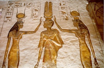
For the Empress, there is something exceedingly odd. The text of the 1985, which faithfully follows the 1927 original, says at the bottom of its p. 72:

In case the image disappears some day, I have typed it out:

In the image, I see no crocodile with a human head, but probably he is speaking figuratively; there is a human head with what appears to be the body of a snake coming out of it, or maybe going around it, or binding him. And if there are moon-horns, the left one has been somehow cut off by the printer.
What the 2012 does is even stranger. In its section on the Empress, we see the following (p. 68):

Notice the text that accompanies the image. Unlike the 1985 translation (which I put as an image and a quote just below the picture of Isis and Hathor), this one says the image is a 16th century German engraving (the last sentence of the paragraph is, "Others have followed the correct tradition, as shown in the sixteenth century German engraving at left>"! And I expect that is what is being shown. It does not appear elsewhere in the book. It appears to be a Madonna, perhaps holding the dead Christ against her, or perhaps it is the Christ Child. I can’t find it on Google. However she does appear to be standing on a crescent moon, horns downward.
The original text clears up the mystery. The end drawing, opposite the text in question, is indeed the same sketch of the 18th century sculpture that appears in the Appendix. However the original give us the full sketch, with both horns visible, pointing downward.

Incidentally, if you were wondering about what “sublime Womanhood” was in French, it is “Féminité sublimée", sublimated Femininity. That means either “Femininity made sublime” or “sublimated Femininity” in an alchemical sense, i.e. turned into a gaseous state. Perhaps they are the same thing, womanhood purified of the dross it picked up eating the Forbidden Fruit. As he says, the sign for Mercury turned upside down is the sign for Venus with a crescent moon below--thus Venus in the heavens..
For 4, the Emperor, all post-1916 editions omit the end drawing, which is of a phoenix in the alchemical symbol for sulfur: a flammable bird in a flammable substance. In the Appendix, this image occurs on p. 215 of the 2012 (very small), p. 207 of the 1985 and p. of the 2014 French (both better).
They also omit another symbol that Wirth created, I think he says it is a stylizatin of the fleur-de-lys that is on the tip of the Emperor's scepter. I cannot find this image in the Appendix.

For 5, the Pope, they all again omit the end drawing, of a five pointed star. This is what makes the five pointed star in the series at the beginning a symbol of the Pope card. But there are plenty of other five-pointed stars in that section; this one does not appear in the Appendix, so I give it below.

For 6 the Lover, the 2012 omits the drawing of a cube near the end with various alchemical symbols on it. The cube of course is six sided. It also appears in the Appendix, in all the editions (p. 215 of the 2012, p. 207 of the 1985).

For 7 the Chariot, they all omit, everywhere, the end drawing of a six-pointed star with a 7 in it.

Also, they all try to reproduce an actual alchemical engraving, both here and in the Appendix, instead of using Wirth’s drawing. Below is the 2012, followed by Wirth’s drawing in the 1927.


For 9, the Hermit, they all omit With’s end drawing, which is of his “Bootes” astronomical card, formerly called “Le Bouvier,” “The Herdsman.”

For 10, the Wheel of Fortune, the 2012 omits all three of Wirth’s drawings and instead substitute two emblems of the editor’s choosing.

The first, above, I recognize as being from the Rosarium Philosophorum; it is what the accompanying verses say is the Empress, although it in fact has both a male and a female head. But like the Wheel of Fortune it is the tenth emblem in its series. Notice that the horns of the moon point up!

The other is God the Father above the conventional way in which Ezekiel’s wheel was represented, as two interlocking wheels along with, on the left, the four figures of the tetramorph, which Ezekiel reported to be present. It looks like something Wirth would draw, but I cannot find it anywhere in the original. Ezekiel’s wheel is what the occultists associated to the tarot Wheel of Fortune, an association that has no historical basis in relation to the medieval image used by that card.
What Wirth in fact has on these pages is a different set of images, although also on the theme of the tetramorph. One, missing only from the 2012, is the tetramorph inside an ouroborus or tail-eating snake. Another image, missing in this place from all post-1927 editions, is the tetramorph surrounding a circle surrounding another circle surrounding two triangles surrounding a square. Both are in the Appendix (pp. 210-11 of the 2012, p. 202 of the 1985) but the latter is too small there .

The “man” is an upside down angel who seems to be clutching to a parrot. Perhaps I am missing something.
 Another missing image in this section, only from the 2012, is a dolphin
on a trident, one not seen elsewhere in the book. It is apparently an
image of Mercury/Quicksilver, as it is in the same place as the 2012’s
Empress.
Another missing image in this section, only from the 2012, is a dolphin
on a trident, one not seen elsewhere in the book. It is apparently an
image of Mercury/Quicksilver, as it is in the same place as the 2012’s
Empress.
or 11, all the post-1927 editions all omit an end drawing of Cybele and her tame lions that Wirth associates to this card. It can be found in the Appendix (p. 220 of the 2012, p. 212 of the 1985). The 2012 also omits another emblem that Wirth created for this card, a five pointed star inside a six-pointed star. This one does not appear elsewhere in the book; so I need to show it here.

For 12, they all omit his end-drawing of the associated alchemical symbol (upside down sulphur) surrounded by geometrical patterns. It appears in the Appendix (p. 219 of the 2012, p. 211 of the 1985), but so poorly reproduced in both that I give it here. In a good reproduction, these patterns reveal themselves to be the signs of the zodiac.

For 13, they all omit the end-drawing of a skull enclosed by a Masonic calipers that Wirth associates to this arcanum. It appears in the Appendix (p. 217 of 2012, p. 209 of the 1985).
For 14 the 2012 (only) omits Wirth's drawing of the god Indra, whom he associates to this arcanum. Nor is it in the Appendix. There is no end drawing.

For 15 the 2012 omits the end-drawing of a devil covered with eyes, which can be found in the Appendix (p. 212 of 2012, p. 204 of 1985); it also omits his symbol for all seven of the planets, as I discussed in relation to chapter five of part one.
For 16 they all omit the end-drawing of geometrical patterns; it does not appear elsewhere in the book, either. Abrac on ATF observed that it seems to be a stylized face, which can be seen by comparing the abstract pattern with a more representational drawing of his earlier.


For 17 they all omit the end-drawing of the goddess Ishtar, whom he associates to this arcanum. The 2012 omits another drawing of the same goddess, as a warrior; the other was as a cup-bearer. Both appear in the Appendix, the latter below the former (p. 220 of the 2012, p. 212 of the 1985).
For 18 they all omit a “winged globe” end drawing. It appears in the Appendix (p. 216 of 2012, p. 220 of 1985). The 2012 adds 17th century illustrations of the constellations of Canus Major and Canus Minor, which Wirth does discuss but does not illustrate.
For 19 they all omit his end-drawing of a bearded man on horseback, flying a banner. This might be meant as his improvement on Vieville and Waite, who have boy riders. Perhaps he wants the rider to be the Christ of Rev. 19:11, whom he feels should be bearded. It is not found elsewhere in the book.

For 0, the Fool, they all omit Wirth’s drawing of the Fool as a contortionist.

In Part III of the book some of the chapters of the original have end drawings, missing in all post-1927 edition. The chapter on “The Program of Initiation” has a drawing of a dragon or crocodile holding a tripartite globe surmounted by a cross. It can be found in the Appendix (p. 211 of 2012, p. 203 of 1985). The chapter on “Hermetic Philosophy” has a well known alchemical emblem on the theme of “V.I.T.R.I.O.L,” which are the first letters of an alchemical saying. It is in the Appendix, very small (p. 213 of 2012, p. 205 of 1985). The chapter on “Masonic Correspondences” has a drawing of what in the Appendix he calls “a master craftsman,” a man in a robe holding calipers and a drawing board (p. 209 of the 1985, omitted entirely from the 2012).

The Appendix itself has before and after it a rather nice emblem on the “TARO(T)/ROTA(R)” theme, with the Ankh of life in the middle.

Conclusion
All in all, the 2012 English version is good enough for the casual reader, but not for someone who really wants to get into the text. (However you have these posts to compensate with.) The 1985 version is better in this regard as it has more of Wirth’s illustrations in the places he put them, following the later the French editions. They, too, omit the end drawings. Mary Greer’s worthy 2012 introduction can be read in Amazon's online portion of the book, and all the cards are online. The translation, the same in the two English editions (except for restoring Wirth’s “pantacle”, although in fact the English equivalent by now really is “pentacle”), is good but not always reliable, especially on alchemical matters; to be sure of a reading (hopefully), it is necessary to consult one of the French editions.
And remember, I have not been giving a synopsis of Wirth's book, but rather of what the 2012 omits, changes, or gets wrong in transmitting Wirth's book (although in the course of doing so I have had to present some of his ideas and images as well). The publication nonetheless remains a fine undertaking, given how little attention Wirth gets these days, and Mary Greer is to be commended for lending her name to it. Now I can start seriously studying him.
For the final post in this blog, about Wirth's 1931 "Introduction to the Study of the Tarot", you may have to go up to the sidebar table of contents and click on the last title there.
I start with the Popess, because in the case of the Magician there are no omissions. For the her, all the post-1927 editions omit the drawing at the end of the section, which Wirth says in the Appendix (p. 220 of the 2012, p. 212 of 1985) is Isis. Clearly we are to think of this card as Isis (as he later says explicitly at the beginning of Chapter 10).
Wirth is not that bad an Egyptologist. In Egypt statues of seated Isis were frequently of black stone; and her gesture here resembles that of blessing in portrayal’s of her with the queen and Hathor (the oneon the left, from http://www.grisel.net/abu_simbel.htm)
For the Empress, there is something exceedingly odd. The text of the 1985, which faithfully follows the 1927 original, says at the bottom of its p. 72:
In case the image disappears some day, I have typed it out:
The Christian artists were inspired by Alchemy when they placed a crescent beneath the foot of the heavenly Virgin, but they often made the error of drawing the crescent with its horns upturned. Others have followed the right tradition, witness the Spanish sculptor of the eighteenth century to whom we owe the very symbolic Madonna, as drawn opposite, after the original preserved in Paris in the sacristry of the church of St. Thomas.In fact there is nothing on the opposite page except a little text at the top and a big blank space (https://blogger.googleusercontent.com/img/b/R29vZ2xl/AVvXsEjKez2eA93QRvxVtU1qU7xBP-Qc0qLReYxc5nVVEQwfjWuXTwAEJtBFcnwQV2-z0C5cAcLcmsu2Vcin5UyRUhntrrKIo3UcDao1loIRK2CfzOR7muJFwf8o04wa4Trymj0mKcKRrWukcZ0/s1600/BookScanCenter_12_3.jpg). It is the same in the 2014 French edition. The only way we might get an inkling of what image he means is that in the Appendix he says he is giving us a sketch "copying the Spanish Madonna kept in Paris in the sacristy of the church of St. Thomas d'Aquinas" (p. 204, corresponding to 212 of the 2012, which I give below). He must mean the image on the preceding page (of the 1985). But what he says about it is something quite different.
The crocodile receives a human head and winds itself around the terrestrial globe which bears the Immaculate Virgin.... From the esoteric point of view here it is question of the demon of selfishness which sublime womanhood must conquer.
In the image, I see no crocodile with a human head, but probably he is speaking figuratively; there is a human head with what appears to be the body of a snake coming out of it, or maybe going around it, or binding him. And if there are moon-horns, the left one has been somehow cut off by the printer.
What the 2012 does is even stranger. In its section on the Empress, we see the following (p. 68):
Notice the text that accompanies the image. Unlike the 1985 translation (which I put as an image and a quote just below the picture of Isis and Hathor), this one says the image is a 16th century German engraving (the last sentence of the paragraph is, "Others have followed the correct tradition, as shown in the sixteenth century German engraving at left>"! And I expect that is what is being shown. It does not appear elsewhere in the book. It appears to be a Madonna, perhaps holding the dead Christ against her, or perhaps it is the Christ Child. I can’t find it on Google. However she does appear to be standing on a crescent moon, horns downward.
The original text clears up the mystery. The end drawing, opposite the text in question, is indeed the same sketch of the 18th century sculpture that appears in the Appendix. However the original give us the full sketch, with both horns visible, pointing downward.
Incidentally, if you were wondering about what “sublime Womanhood” was in French, it is “Féminité sublimée", sublimated Femininity. That means either “Femininity made sublime” or “sublimated Femininity” in an alchemical sense, i.e. turned into a gaseous state. Perhaps they are the same thing, womanhood purified of the dross it picked up eating the Forbidden Fruit. As he says, the sign for Mercury turned upside down is the sign for Venus with a crescent moon below--thus Venus in the heavens..
For 4, the Emperor, all post-1916 editions omit the end drawing, which is of a phoenix in the alchemical symbol for sulfur: a flammable bird in a flammable substance. In the Appendix, this image occurs on p. 215 of the 2012 (very small), p. 207 of the 1985 and p. of the 2014 French (both better).
They also omit another symbol that Wirth created, I think he says it is a stylizatin of the fleur-de-lys that is on the tip of the Emperor's scepter. I cannot find this image in the Appendix.
For 5, the Pope, they all again omit the end drawing, of a five pointed star. This is what makes the five pointed star in the series at the beginning a symbol of the Pope card. But there are plenty of other five-pointed stars in that section; this one does not appear in the Appendix, so I give it below.
For 6 the Lover, the 2012 omits the drawing of a cube near the end with various alchemical symbols on it. The cube of course is six sided. It also appears in the Appendix, in all the editions (p. 215 of the 2012, p. 207 of the 1985).
For 7 the Chariot, they all omit, everywhere, the end drawing of a six-pointed star with a 7 in it.
Also, they all try to reproduce an actual alchemical engraving, both here and in the Appendix, instead of using Wirth’s drawing. Below is the 2012, followed by Wirth’s drawing in the 1927.
For 9, the Hermit, they all omit With’s end drawing, which is of his “Bootes” astronomical card, formerly called “Le Bouvier,” “The Herdsman.”
For 10, the Wheel of Fortune, the 2012 omits all three of Wirth’s drawings and instead substitute two emblems of the editor’s choosing.
The first, above, I recognize as being from the Rosarium Philosophorum; it is what the accompanying verses say is the Empress, although it in fact has both a male and a female head. But like the Wheel of Fortune it is the tenth emblem in its series. Notice that the horns of the moon point up!
The other is God the Father above the conventional way in which Ezekiel’s wheel was represented, as two interlocking wheels along with, on the left, the four figures of the tetramorph, which Ezekiel reported to be present. It looks like something Wirth would draw, but I cannot find it anywhere in the original. Ezekiel’s wheel is what the occultists associated to the tarot Wheel of Fortune, an association that has no historical basis in relation to the medieval image used by that card.
What Wirth in fact has on these pages is a different set of images, although also on the theme of the tetramorph. One, missing only from the 2012, is the tetramorph inside an ouroborus or tail-eating snake. Another image, missing in this place from all post-1927 editions, is the tetramorph surrounding a circle surrounding another circle surrounding two triangles surrounding a square. Both are in the Appendix (pp. 210-11 of the 2012, p. 202 of the 1985) but the latter is too small there .
The “man” is an upside down angel who seems to be clutching to a parrot. Perhaps I am missing something.

or 11, all the post-1927 editions all omit an end drawing of Cybele and her tame lions that Wirth associates to this card. It can be found in the Appendix (p. 220 of the 2012, p. 212 of the 1985). The 2012 also omits another emblem that Wirth created for this card, a five pointed star inside a six-pointed star. This one does not appear elsewhere in the book; so I need to show it here.
For 12, they all omit his end-drawing of the associated alchemical symbol (upside down sulphur) surrounded by geometrical patterns. It appears in the Appendix (p. 219 of the 2012, p. 211 of the 1985), but so poorly reproduced in both that I give it here. In a good reproduction, these patterns reveal themselves to be the signs of the zodiac.
For 13, they all omit the end-drawing of a skull enclosed by a Masonic calipers that Wirth associates to this arcanum. It appears in the Appendix (p. 217 of 2012, p. 209 of the 1985).
For 14 the 2012 (only) omits Wirth's drawing of the god Indra, whom he associates to this arcanum. Nor is it in the Appendix. There is no end drawing.
For 15 the 2012 omits the end-drawing of a devil covered with eyes, which can be found in the Appendix (p. 212 of 2012, p. 204 of 1985); it also omits his symbol for all seven of the planets, as I discussed in relation to chapter five of part one.
For 16 they all omit the end-drawing of geometrical patterns; it does not appear elsewhere in the book, either. Abrac on ATF observed that it seems to be a stylized face, which can be seen by comparing the abstract pattern with a more representational drawing of his earlier.
For 17 they all omit the end-drawing of the goddess Ishtar, whom he associates to this arcanum. The 2012 omits another drawing of the same goddess, as a warrior; the other was as a cup-bearer. Both appear in the Appendix, the latter below the former (p. 220 of the 2012, p. 212 of the 1985).
For 18 they all omit a “winged globe” end drawing. It appears in the Appendix (p. 216 of 2012, p. 220 of 1985). The 2012 adds 17th century illustrations of the constellations of Canus Major and Canus Minor, which Wirth does discuss but does not illustrate.
For 19 they all omit his end-drawing of a bearded man on horseback, flying a banner. This might be meant as his improvement on Vieville and Waite, who have boy riders. Perhaps he wants the rider to be the Christ of Rev. 19:11, whom he feels should be bearded. It is not found elsewhere in the book.
For 0, the Fool, they all omit Wirth’s drawing of the Fool as a contortionist.
In Part III of the book some of the chapters of the original have end drawings, missing in all post-1927 edition. The chapter on “The Program of Initiation” has a drawing of a dragon or crocodile holding a tripartite globe surmounted by a cross. It can be found in the Appendix (p. 211 of 2012, p. 203 of 1985). The chapter on “Hermetic Philosophy” has a well known alchemical emblem on the theme of “V.I.T.R.I.O.L,” which are the first letters of an alchemical saying. It is in the Appendix, very small (p. 213 of 2012, p. 205 of 1985). The chapter on “Masonic Correspondences” has a drawing of what in the Appendix he calls “a master craftsman,” a man in a robe holding calipers and a drawing board (p. 209 of the 1985, omitted entirely from the 2012).
The Appendix itself has before and after it a rather nice emblem on the “TARO(T)/ROTA(R)” theme, with the Ankh of life in the middle.
Conclusion
All in all, the 2012 English version is good enough for the casual reader, but not for someone who really wants to get into the text. (However you have these posts to compensate with.) The 1985 version is better in this regard as it has more of Wirth’s illustrations in the places he put them, following the later the French editions. They, too, omit the end drawings. Mary Greer’s worthy 2012 introduction can be read in Amazon's online portion of the book, and all the cards are online. The translation, the same in the two English editions (except for restoring Wirth’s “pantacle”, although in fact the English equivalent by now really is “pentacle”), is good but not always reliable, especially on alchemical matters; to be sure of a reading (hopefully), it is necessary to consult one of the French editions.
And remember, I have not been giving a synopsis of Wirth's book, but rather of what the 2012 omits, changes, or gets wrong in transmitting Wirth's book (although in the course of doing so I have had to present some of his ideas and images as well). The publication nonetheless remains a fine undertaking, given how little attention Wirth gets these days, and Mary Greer is to be commended for lending her name to it. Now I can start seriously studying him.
For the final post in this blog, about Wirth's 1931 "Introduction to the Study of the Tarot", you may have to go up to the sidebar table of contents and click on the last title there.
Subscribe to:
Posts (Atom)